The Essential Guide to Mobile-First Responsive Web Design
Written by: Haidersafi
Facts checked by: Haidersafi

Founded in 2025, FusioPoint is a global web design and mobile app development agency, trusted for delivering innovative and secure digital solutions.
Have you ever noticed how your favorite websites look and function perfectly, whether you’re viewing them on a desktop, a tablet, or a smartphone? This seamless experience is the result of responsive web design, a fundamental approach that ensures your website works smoothly across all screen sizes. With mobile devices now accounting for over half of all global internet traffic, adopting a mobile-first responsive design strategy isn’t just a benefit—it’s a necessity. It ensures you provide the best possible user experience, which is crucial for engagement and business growth.
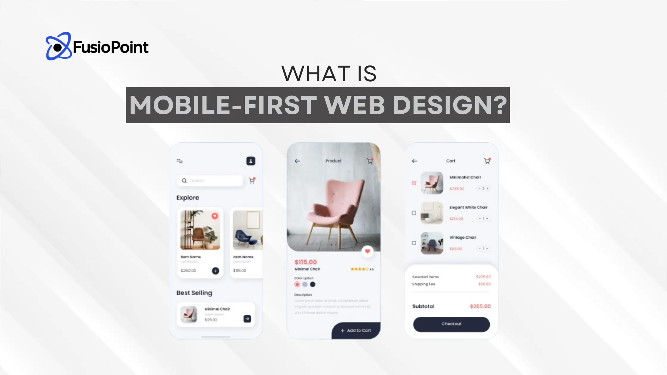
What is Mobile-First Web Design?
The mobile-first concept is a development strategy where designers and developers prioritize the creation of the user interface for the smallest screen—the mobile device—first. The design is then progressively scaled up for larger screens like tablets and desktops. This approach recognizes the increasing number of global mobile users and focuses on enhancing mobile usability by addressing the challenges of smaller screens and slower connections from the start.
Enhance User Experience and Performance
Mobile-first design is inherently user-centric. By prioritizing essential functions on small displays, it fosters an intuitive navigation experience and improves usability. This approach also naturally involves speed optimization from the project’s inception. It forces a focus on rapid load times and performance, which is vital for mobile users who often rely on cellular data.
Boost Search Engine Visibility
Google favors mobile-friendly websites and primarily uses the mobile version of your content for indexing and ranking (known as mobile-first indexing). A mobile-first design strategy is a powerful tool for improving your website’s Search Engine Optimization (SEO), enhancing its visibility and placement in search results.
Reduce Bounce Rates and Drive Sales
When your content is easily accessible and readable on mobile devices, users are more likely to stay on your site and engage, which leads to lower bounce rates. This positive user behavior is favored by search engines. Furthermore, with a significant portion of e-commerce sales now occurring on mobile devices, a well-optimized, responsive design is vital for attracting and converting mobile customers, directly impacting your return on investment (ROI).
Mobile-First vs. Responsive Design: Key Differences
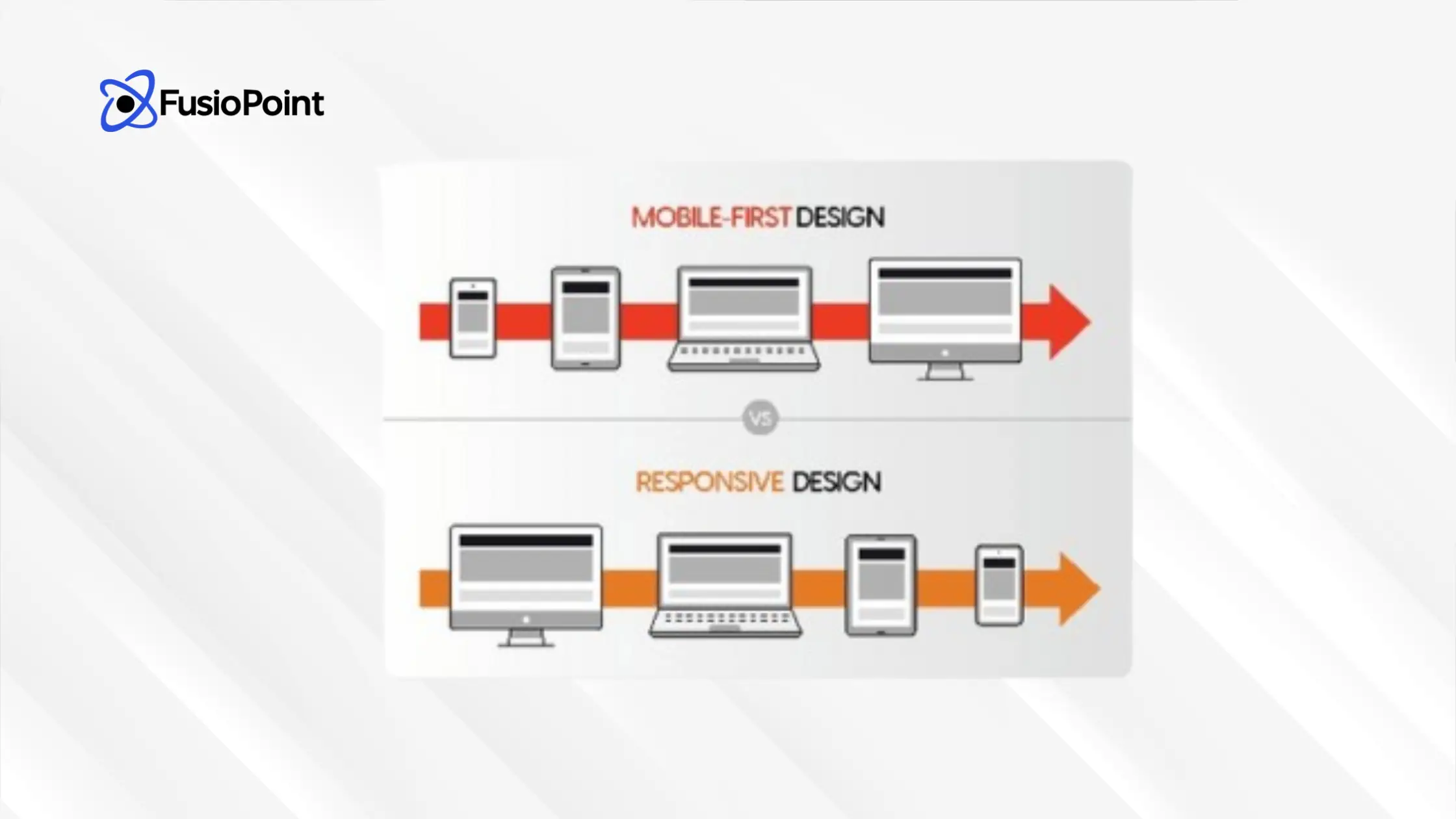
While both methods aim to deliver a consistent experience across devices, they differ in their starting point and philosophy.
|
Aspect |
Responsive Design |
Mobile-First Design |
|
Philosophy |
Adapts the layout to the user’s screen size. |
Starts with the smallest screen and scales up. |
|
Development |
Begins with desktop design, then adjusts for smaller screens. |
Begins with mobile design, then enhances for larger screens. |
|
Initial Focus |
Desktop and larger screens. |
Mobile and smaller screens. |
|
Content Strategy |
Content is often reduced or restructured for small screens. |
Content is progressively added as the screen size increases. |
|
Performance |
Typically optimized for desktop. |
Typically optimized for mobile. |
8 Best Practices for a Successful Mobile-First Approach
Effective mobile-first design requires a deliberate strategy that combines smart design choices with development best practices.
Design for Touchscreens
Since most smartphone users utilize touch, design clickable elements like buttons, icons, and links to be large enough (at least 44 pixels wide/tall is recommended) and spaced adequately for easy tapping with a thumb. Avoid desktop-centric features like hover effects.
Prioritize Essential Content First
Since most smartphone users utilize touch, design clickable elements like buttons, icons, and links to be large enough (at least 44 pixels wide/tall is recommended) and spaced adequately for easy tapping with a thumb. Avoid desktop-centric features like hover effects.
Optimize for Speed and Performance
Mobile users expect rapid access. Optimize all images, videos, and graphics to ensure quick page loads and response times. Utilize techniques like minimizing file sizes and using responsive design strategies so elements adjust naturally to different screen sizes.
Use Mobile-Friendly Design Patterns
Employ familiar patterns that enhance mobile usability, such as card layouts, off-canvas navigation (hidden until engaged to save screen space), and expandable widgets (like accordions) to organize content without cluttering the display.
Utilize Responsive Images
Employ solutions like the HTML srcset property to deliver images that are the correct size for the user’s device, which cuts down on load times. Where appropriate, use Scalable Vector Graphics (SVGs), as they scale perfectly without losing quality and have smaller file sizes.
Design Progressively
Start with the basics that work well on mobile, and then progressively add features and complexity only when scaling up to larger screens. This approach creates a solid, consistent foundation for your entire digital environment.
Think Thumb-Friendly
Position key interactive elements within the “thumb zone”—the area where users naturally interact with their device one-handed—for the most comfortable and natural experience.
Conduct Usability Testing
Test your website on a variety of screen sizes, device orientations, and network speeds. Collect user feedback throughout the design process to ensure your mobile experience is intuitive and functional based on actual user behavior.
Essential Tools for Responsive Web Design
The right tools streamline the mobile-first design process, allowing you to build, test, and perfect your responsive site.
Google’s Mobile-Friendly Test
A free tool that quickly assesses whether your website is mobile-friendly by analyzing load times and usability. It provides detailed analysis and practical suggestions for improvement in line with Google’s policies.
Bootstrap
A popular, open-source framework for building responsive, mobile-first websites. It provides a responsive grid system and a collection of pre-made components for rapid, consistent development across all devices.
WordPress Themes
The WordPress ecosystem offers a vast selection of responsive themes that automatically adjust to various screen sizes. These themes are often SEO-friendly and provide a cost-effective, flexible foundation for a mobile-first site.
What is mobile-first web design?
Why is mobile-first design better for SEO?
What is Progressive Enhancement?
How does mobile-first impact load time?
In this article
- What is Mobile-First Web Design?
- Mobile-First vs. Responsive Design: Key Differences
- 8 Best Practices for a Successful Mobile-First Approach
- Essential Tools for Responsive Web Design
Web Design, Development
Haidersafi
Haider Safi is a senior content writer who excels at making complex tech ideas simple and engaging. He's a strategic storyteller for the digital world, giving a clear voice to breakthrough concepts. Outside of writing, you'll find him diving into a great book or tracking the next big trend.